

In this story, you’ll learn the following:
- Fhatee uses the Pulse dashboard to track employee productivity but sees discrepancies with Presence Analytics affecting employee scores.
- Employees adapt behavior based on their activity scores, leading to an emphasis on busy work rather than meaningful productivity.
- Fhatee critiques the reliance on dashboards, questioning whether human resources and management accurately measure productivity or simply activity.
- The dashboard becomes a source of identity for employees, reducing them to numerical scores rather than recognizing their contributions.
- The company redesigns Pulse to include fewer metrics and prompts for interpretation, acknowledging that human value extends beyond observable traces.
Employee Productivity and Presence Analytics
Every Monday morning, Fhatee opened the company’s productivity dashboard. It counted people to help track team activity.
It was called Pulse. The executives loved it. Green meant productive. Yellow meant attention. Red meant intervention.
At first, Fhatee thought Pulse was useful. It showed projects, deadlines, completed tasks, response times, and team progress. It helped managers see where work was getting stuck.
Then the company introduced Presence Analytics. Pulse began displaying another number beside every employee’s name: Activity Score: 87%
The higher the number, the healthier the employee was supposed to be. Soon, people started behaving differently. Employees answered messages immediately, even during lunch. They kept their computers awake while making coffee. Meetings proliferated because they created activity. People were scared to go offline.
Fhatee noticed something strange. Her colleague Daniel had taken two weeks of approved leave. On the dashboard, his score fell from 91% to 0%. Under his name, LOW ACTIVITY appeared.
Fhatee frowned. “He’s on leave,” she whispered.
Her manager shrugged and said, “The system doesn’t know that.”
“But HR does,” Fhatee responded swiftly.
“The dashboard is what leadership looks at,” her manager defended.
That sentence stayed with Fhatee.
Pulse Dashboard Employee Activity Analysis
The following month, another employee resigned. Their name remained on the dashboard for weeks, showing less and less activity, then vanished.
Then someone was terminated. The dashboard displayed the same downward curve. Fhatee began wondering whether Pulse was actually measuring productivity—or simply measuring how busy the dashboard looked.

One afternoon, the company announced that work-life balance was now a strategic priority. A new banner appeared across Pulse: WE VALUE YOUR WELL-BEING.
Employee Activity vs. Productivity Measurement Discrepancy
Below it was a ranking of employee activity. Fhatee stared at the contradiction.
The company said, “Take your leave.”
The dashboard said, “Your activity has fallen.”
The company said, “Disconnect after work.”
The dashboard said, “Your responsiveness has decreased.”
The company said, “Focus on meaningful outcomes.”
The dashboard said, “Your activity count is below target.”
Fhatee finally asked the question nobody seemed to be asking. “What exactly are we measuring?” Silence filled the meeting.
Someone answered, “Productivity.”
“How do we know?” Fhatee asked
“Because the numbers show it,” an employee responded.
“But the numbers aren’t productivity. They’re indicators,” replied Fhatee.
System Inactivity vs. Productivity Analysis
The room became uncomfortable.
Fhatee continued. “If someone spends three hours thinking through a difficult problem, the system may see inactivity. If someone spends three hours answering meaningless messages, the system may see productivity. The system may interpret an absence if someone is on leave. The system may interpret a resignation as a decline in performance.”
She pointed towards the dashboard and said, “We’re treating different realities as though they’re the same variable.”
Her manager leant back. “So what are you suggesting?”
Fhatee looked at the screen. “I’m suggesting that we’re no longer only measuring work.”
“What else are we measuring?” her manager asked.
“People,” Fhatee said swiftly.

Nobody spoke. Then Fhatee noticed something even more troubling. Employees had started describing themselves using their scores.
“I’m 82,” said Rose.
“I’m usually a 94,” Jun said, smiling.
“My score dropped last month,” Donna shared, pouting.
Fhatee noticed that no one said, “I solved a hard problem.” “I was helping a colleague.”
Fhatee remained silent, took a deep breath, and said, “Today I learned something new,” and she went on saying, “I got over my fatigue. I spent the afternoon thinking.”
Dashboard Productivity Paradox
Their identities were slowly becoming numerical. The dashboard had begun as an instrument for observing work. Now people were observing themselves through it. And because people wanted to remain valuable, they adapted. They optimized their behavior for the measurement system. The strange thing was that productivity initially appeared to improve.
Activity increased. Messages increased. Meetings increased. Online presence increased. Pulse became greener than ever. But meaningful work did not increase at the same rate. The organization had discovered something uncomfortable: it was possible to improve the productivity score without actually improving productivity.
Fhatee called this the Dashboard Paradox. The better people became at satisfying the measurement system, the less certain the organization was about what the measurements actually meant.
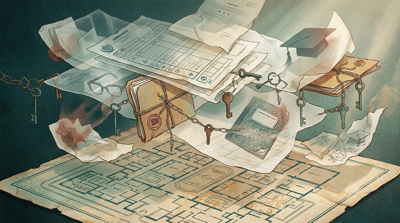
Employee Performance Metrics Critique
One Friday, Fhatee received an automated notification. Your activity score has declined. She looked at her calendar. Fhatee had spent the morning helping a new employee understand a complicated process. She had spent the afternoon reviewing a project that prevented a potentially expensive mistake. Neither activity had produced many dashboard points. Pulse considered her day mediocre.
Fhatee considered it one of her most valuable days that month. For the first time, she didn’t immediately wonder whether the dashboard was right. She wondered whether the question itself was wrong. A score could describe her activity. However, it could not, by itself, define her contribution. And it certainly could not define who she was. She closed Pulse.
Pulse Redesign Rationale
Outside the office, people were leaving for the weekend. Some were working late. Others were resting. They were caring for their families. Some were thinking. Some were doing nothing measurable at all. And Fhatee realized that perhaps the most important thing a productivity system needed to learn was something no dashboard could easily count: A human being is not the sum of their observable traces.

The following Monday, the company redesigned Pulse. This change did not occur because Fhatee had convinced everyone that measurement was inadequate. She hadn’t. Instead, she had convinced them of something more difficult: measurement requires interpretation. Absence was not automatically failure. Activity was not an automatic contribution. A declining number was not automatically a declining person. And a dashboard could help an organization see patterns—but it should never be allowed to decide what a person means.
The new Pulse had fewer colors. Fewer rankings. Fewer alarms. And, beside every metric, there was a small question: “What else might explain this?”
Fhatee smiled when she saw it. It wasn’t perfect. But at least the system had finally learned to question itself.
SUMMARY
An employee, Fhatee, is looking at the company’s productivity dashboard, Pulse. It was created to monitor team activity and project status. With the introduction of numerical activity scores from Presence Analytics, employees start to change their work behavior to preserve favorable ratings, even when on leave.
Fhatee is concerned whether the dashboard is a true indicator of productivity and says it’s aggregating diverse types of work and also devaluing meaningful contributions.
The system’s concentration on numerical scores cultivates a culture in which employees measure their value by the numbers, not by their contributions.
In the end, Pulse is upgraded to provide a more complete picture of worker efficiency, highlighting the value of analyzing measurements and not just assuming they are an indication of actual productivity. The new dashboard is assessing employee value in a more holistic sense by using more reflective questions rather than traditional metrics.
DISCLAIMER
This writing is for educational purposes and encourages discussions and debate. It aims to provoke critical thinking in several domains, including philosophical psychology and ethics. It is concerned with perception, judgment, and decision-making. Any mention is for debate purposes, not an accusation of wrongdoing.
The information is inconclusive. Readers are cautioned to distinguish fact from interpretation, to hold themselves accountable to proper procedure and permitted findings, and to be responsible in their research and discussion. The discussion around learning’s true value can be deeply personal, so take what resonates and explore further. As you do so, you may form your own view about learning’s true value.
RELATED READINGS
RELATED LINKS
© 2026 CLEVERPENS



Leave a Reply